These two projects are a result of recent collaboration with Transparency International Slovenia. The datasets were provided by the state, and I was asked to develop visualizations that would structure the information in an accessible way. Much help was also provided by members of Institut Jožef Štefan.
State project browser
The first project is a browser of all projects, initiated by state institutions, from 1991 on. The idea was to let users discover, where and for what purposes the money goes in their county. The dataset and visualization allow for exploration by various categories, as well as time.
The projects in the dataset also contain projects that are still in the planning phase, and won’t be completed until year 2025. With this tool, citizens can hopefully inspect the planned expenditures for roads, water sources, and other categories of infrastructure, culture and other fields of development, and compare that with their own expectations.
It allows browsing and filtering of projects by statistical regions and counties, as well as displaying the timeline of all projects, which is basically an expandable version of a Gantt chart.
To see the interactive project website, click here, or click the image below.
State projects app
The original data is provided on the project’s “About” page.
County budget browser
The new project is a straightforward visualization of county budgets. The budgets are displayed as dynamic, zoomable hierarchical (“sunburst”) diagrams. They react to each other, allowing a side-by-side comparison of budgets of two user-selected counties.
The visualization enables users to delve into expenses and incomes of all Slovenian counties on separate tabs.
To see the interactive project website, click here, or click the image below.
County budgets app
Technology and design
The data cleanup and preparation was done with some Python scripts. The sunburst diagram accepts hierarchical data in a tree format, so this provided an interesting exercise of converting a tabular dataset into a nested dictionary of optional depth.
The visualizations were done in d3, which is really an indispensable tool for any serious work in online visualization.
Both projects were minimalistically, yet expertly designed by Tomaž Plahuta (Bitnik, Eno).
Check out the projects and let me know your opinion in the comments!
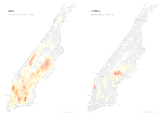
This is a technical explanation of procedure to map parking infractions in Manhattan for every available car make. To see the interactive visualization, click here, or click the image below. Otherwise read on.
Heatmaps for Audi and Bentley
Last year I published an Android app to enable Slovenian drivers to better avoid areas frequently inspected by parking wardens. It works by geolocating the user and then plotting issued paring tickets in the vicinity, with a breakdown by month, time of day and temperature on another screen. It was not a huge hit, but it did reasonably well for such a small country and no marketing budget.
I was thinking of making a version for New York City, but then abandoned the project. These visualizations are all that remains of it.
I started with downloading the data from New York Open Data repository. It’s here. The data is relatively rich, but it’s not geocoded. Luck had it that Mapbox just rolled out a batch geocoder at that time, and it was free with no quotas. So I quickly sent around 100,000 adresses through it and saved the results in a database for later use. The processed result is now available on Downloads page in form of JSON files, one per car make.
The actual drawing procedure was easier than I thought. I downloaded street data from New York GIS Clearinghouse and edited out everything but Manhattan with QGis.
First I tried a promising matrix approach, but I was unable to rotate the heatmap so that it would make sense. Here’s an example for Audi:
Matrix – Audi
As you can see, it is a heatmap, but doesn’t look very good.
So I wrote a Python script that went through all street segments and awarded a point if there was an infraction closer that 100 meters from the relevant segment. Then I just used matplotlib to draw all the street segments, coloring them according to the maximum segment value.
A result for Audi now looks like this:
Audi
All that remained was drawing required images for animated GIFs, each for every hour for every car make. This was done with minimal modifications to original script (I learned Python multithreading in the process). The resulting images were then converted to animated GIFs with ImageMagic.
The whole procedure took approximately 12h of calculating and rendering time on a i7-6700 with 32 GB RAM. I guess I could shave several hours from that time, but I just let it run overnight.
See interactive version here, and tell me what you think in the comment section, if you feel like it.
This post and maps were inspired by Moritz Stefaner’s -ach, -ingen, -zell. I firmly believe in giving credits to whom they are due, so there it is.
That said, I embarked into a similar adventure, first for Slovenia. Etimology of Slovenian towns and other populated places may differ a little from German one, so I was naturally curious what it would be like on a map. I had several geo files for Slovenia around, and also a comprehensive list of all populated places with coordinates, making this a relatively short endeavour.
In addition to common suffices suffixes, I also extracted common prefixes. This is because many Slovenian place names begin with “Gornja” (Upper) or “Velika” (Great), so I wanted to see if there are meaningful spatial distributions of these names. It turns out that they are.
For example, this one. By columns: “gornja” (a variant of “upper) vs “dolnja” (variant of “lower”), “zgornja” and “dolnja” (another couple of variations on the same dichotomy), the “velika” and “mala” (“great” and “small”). It’s apparent that places with those prefixes have characteristic spatial distributions. Why, I don’t know. Dialects of Slovenian language vary wildly, to the point that some of them are virtually incomprehensible to me.
To see the interactive version with more maps, click here, or click the image. Switch between prefixes and suffixes using links in the upper left square.
Distribution of places with some common prefixes
Having written the code and downloaded the geonames.org database, it was just a matter of changing a few things to produce a similar map of a similar distribution in the USA. I colored it a litlle differently, but it’s basically the same thing.
Again, click here or the image for interactive version. Note that you can click on a little link above each map to display the list of place names.
Then, a friend and coworker of mine said that he always wondered about the distributions of U.S. towns with borrowed names from European places. That would effectively show distributions of immigration in early history of USA, with exception of Spanish names, which tend to be on the Mexican border because of history, and some random noise in string matchings.
Here’s an image. Click here or map for interactive version.
Check out the maps! Some technical details: the maps were drawn with d3, and hexagons produced with the hex-binning plugin.
Name matching was not a big challenge, but I did want to find unique suffixes. So I wrote some software to first isolate the most frequently occurring seven character suffixes, then I gradually shortened them until big dropoff, say, more than 50 places occurred. That way I prevented near duplicates to be included, for example “-ville”, “-ille”, “-lle”, which have approximate same distribution, so only one of them has a place on the map.
The biggest challenge was in fact generating a hex grid within the borders, and then fitting the data inside it. That’s the reason the pages need some time to load. I brute-forced that by generating points inside the bounding box and checking if withing the polygon in question with turf.js, then setting all hexagon lenghts to zero, and finally filling them with real data.
Some time ago, I helped Miha Mazzini extract some data from Slovenian Wikipedia. For that, I needed to write a comprehensive parser, extracting not only titles and text, but also number of overall and per-contributor revisions, along with contributor usernames.
So, for each entry, I got a list of contributing accounts and number of edits that were performed by that account. I wondered: how are the areas of expertise distributed among all those contributors? Are some of them specialized mainly for science, some others for politics, and so on? And, perhaps more interestingly, where do these areas overlap? Do we have experts for sport, who also happen to curate political entries?
To find out, I extracted all entries with more than 25 edits, vectorized them by contributing accounts, and ran t-SNE to cluster them spatially and prepare the visualization. When t-SNE layout was complete, k-means clustering was run on the x,y coordinates only to be able to distinguish those areas by color. It must be said that these colored groups don’t always coincide with semantic grouping, so take it with a grain of salt. It’s there mainly to make the map look better and to improve legibility. Font size is in proportion with number of revisions that an entry had so far.
Here’s the entire map as one big 9000 x 6000 image. Click the image to display, then zoom into it with mouse. You can find cropped clusters and some commentary below.
Wikipedia entries by contributing authors – entire map (click for enlargement)
Turns out the areas of expertise are pretty well delineated.
Let’s look at some clusters. Here we have some geographic Wikipedia entries, mainly countries and some historical persons. That sounds logical – editing an entry about a great ruler probably causes one to contribute to an entry about his or her country.
Here are some famous Slovenian people, mostly writers, intermixed with some towns. In the lower left quadrant, there are alo some Slovenian politicians. It sounds funny that the late Communist ruler Josip Broz Tito is so close to Janez Janša, who is the current leader of right-wing opposition. It appears that there is a number of people who edit both entries. I wonder why. Here’s an article by Miles Mathis about editing of Wikipedia. I don’t know what to think of it, but I surely read a lot about autocratic rule of (English) Wikipedia editors to give it some credence. I don’t know about Slovenian version, and I don’t want to speculate, but this is as good an opportunity as any to start thinking about it.
Here is a cluster of lists. It seems that there exists an entire group of people who curate them, regardlessly of their content.
Here’s a funny cluster dealing mostly with public transit in Slovenia. It almost seems that there are some bureaucrats in the government that edit these entries on taxpayer dime. I could probably find that out, if I traced the IPs in the edit logs. If someone hires me as an Internet detective, I might do that, but I made these pictures for fun.
This is an interesting cluster. It appears that many same people edit entries about Euroviviion Contest, parliamentary elections, World cup in basketball and World cups in skiing, along with two new parties in Slovenian parliament: ZAAB, which is the remainder of majority party in the last parliamentary term, and SMC, which is a new majority party. Both parties, along with Pozitivna Slovenija (former majority party) were founded hastily right before elections, and won them by a big landslide. I wonder how would political analysts comment on their (speculatively) members’ love for sports contests.
Here we have many religious personalities, mostly many popes.
A grouping of entries about Slovenian popular music.
Some entries about historical scientists and natural sciences.
More geographical entries, along with some entries about Slovenian highways.
Here’s the center of the map. It would follow logic that entries with many non-specialized contributors are drawn towards it. It’s generally more chaotic that the outskirts, but here are great many contemporary and historical art personalities grouped together..
Another snapshot from the center, mostly consisting of entries about worker’s rights and things related to work.
So here it is. For the technically minded – everything was done in JavaScript with Andrej Karpathy‘s tsnejs library, clusterfck for k-means, and d3 for drawing.
I also made an inverted map, on which the contributors were shown, grouped by the entries they made revisions to. It’s not so interesting for general public, but if someone wants to see it, it’s available by request.
On the basis of previous post, Transparency International Slovenia asked me to collaborate on some projects. This is one of them, and it was launched today on a separate site: kdovpliva.si (English: whoinfluences.si).
It’s an attempt to visualize several networks of lobbyists, their companies, politicians and state institutions. Perhaps the most interesting part is the network of lobbying contacts, which was constructed with data containing around 700 reported contacts between 2011 and late 2014.
As you may imagine, not every lobbying contact is reported. For those who are, records are kept at the Komisija za preprečevanje korupcije (Commission for prevention of corruption, a state institution). Transparency International Slovenia obtained those records as PDF files, since the institution refused to provide them in a machine-readable format. They hired a few volunteers to copy and paste the information in spreadsheets, then handed them to me to visualize them.
You can see the results below. Click here or the image to open the site in a new window. It’s in Slovenian. For methodology, continue reading below the image.
App screenshot – lobbying contacts
Network construction
The meaning of every network is determined by the nature of its nodes and connections. Here, we have four node types:
lobbyists
those who were lobbied – state officials
organizations on which behalf lobbying was performed
state institutions at which the abovementioned officials work
Lobbying contact is initiated by a company or an organization, which employs a lobbyist to to the work. These people then contact state officials of a sufficient influence, who work at appropriate state institution.
So an organization is connected to the lobbyist with a weight of 2, the lobbyist to a state official with a weight of 1, and state official to her institution with a weight of 2. The weights signify the approximate loyalty between these entities. We presupposed that lobbyists are more loyal to their clients than they are to the state officials, with which they must be in a promiscuous relationship. Furthermore, the state officials are also supposed to be more loyal to their employers than to the lobbyists, although this is a daring supposition. But let’s say they are, or at least that they should be.
After some processing, the network emerged. Immediately apparent are the interest groups, centered around seats of power. Here’s an image of the pharmaceutical lobby. It’s centered on the Public Agency for Pharmaceuticals and Medicine. Main actors of influence are companies such as Merck, Novartis, Eli Lilly, Aventis, etc.
Pharmaceutical lobby
A click on the agency node brings up a panel with some details, such as a list of companies (font size indicates the frequency of contact), lobbying purposes and a timeline of lobbying contacts. Here we can see that Novartis and Krka were most active companies, and that they lobbied for purposes of pricing and to limit potential competition by producers of generic drugs.
You can explore the network by yourself to see the other interest groups.
Who lobbied the drug agency?
Some advice from Information Commissioner
Unfortunately, we had to omit lobbyists’ names for reasons of supposed privacy. The Information Commissioner strongly advised us not to display them on the basis of some EU ruling. I’m not an expert in EU law, and perhaps there are good reasons for this. On the other hand, there may not be. I fail to see why this information would not be in public interest, since these decisions have an impact on a significant number of taxpayers, if not all of them.
Anyway, we have the names. After all, we had to use them to connect the network. They are present in raw data, just not displayed.
We’re are probably going to continue developing this project, as new information comes to light and new rulings regarding privacy are issued.